A need for a modern corporate identity
Danske Bank’s existing design was developed in 1999 for the Scandinavian market. During recent years, the bank has expanded into new markets and are now serving more than 5,000,000 clients in 15 countries.
In order to encompass the new markets and fulfil the bank’s ambition of being second-to-none when it comes to digital banking, the corporate identity needed:
A visual update.
A more contemporary look.
New standards for visual brand presence on digital platforms.
Therefore, Danske Bank partnered up with LOOP Associates on a common mission to modernise the banks corporate identity.
Visual differentiation on all platforms
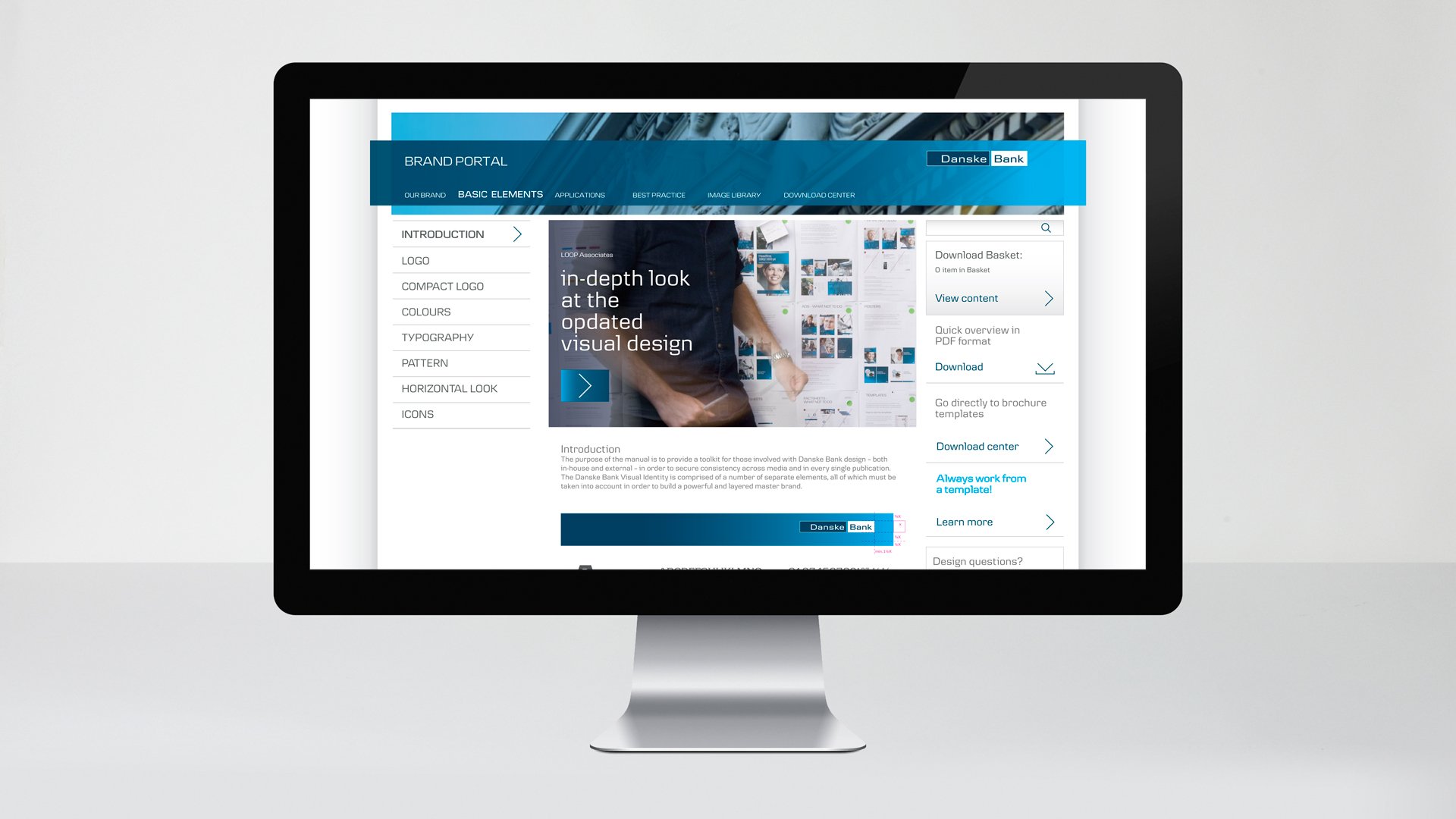
To ensure consistency and maximum brand recognition in the bank’s different markets and segments, LOOP Associates developed a system for visual differentiation which would work on all platforms.
By modernising every aspect of the corporate identity and adding new elements to it, we gave the bank a serious and solid, yet more accommodating, look.
To ensure consistency and ease of use for Danske Bank, we created:
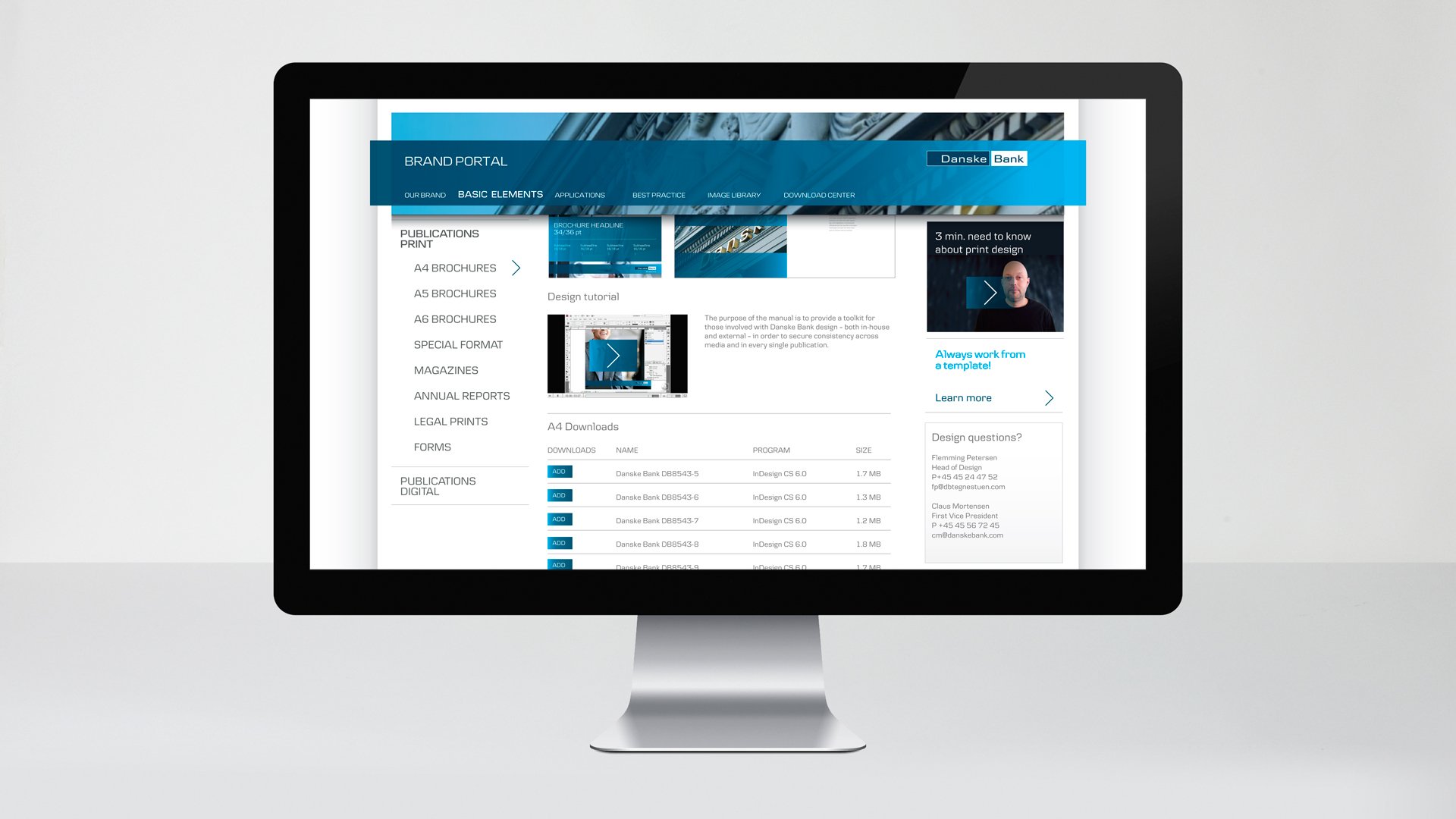
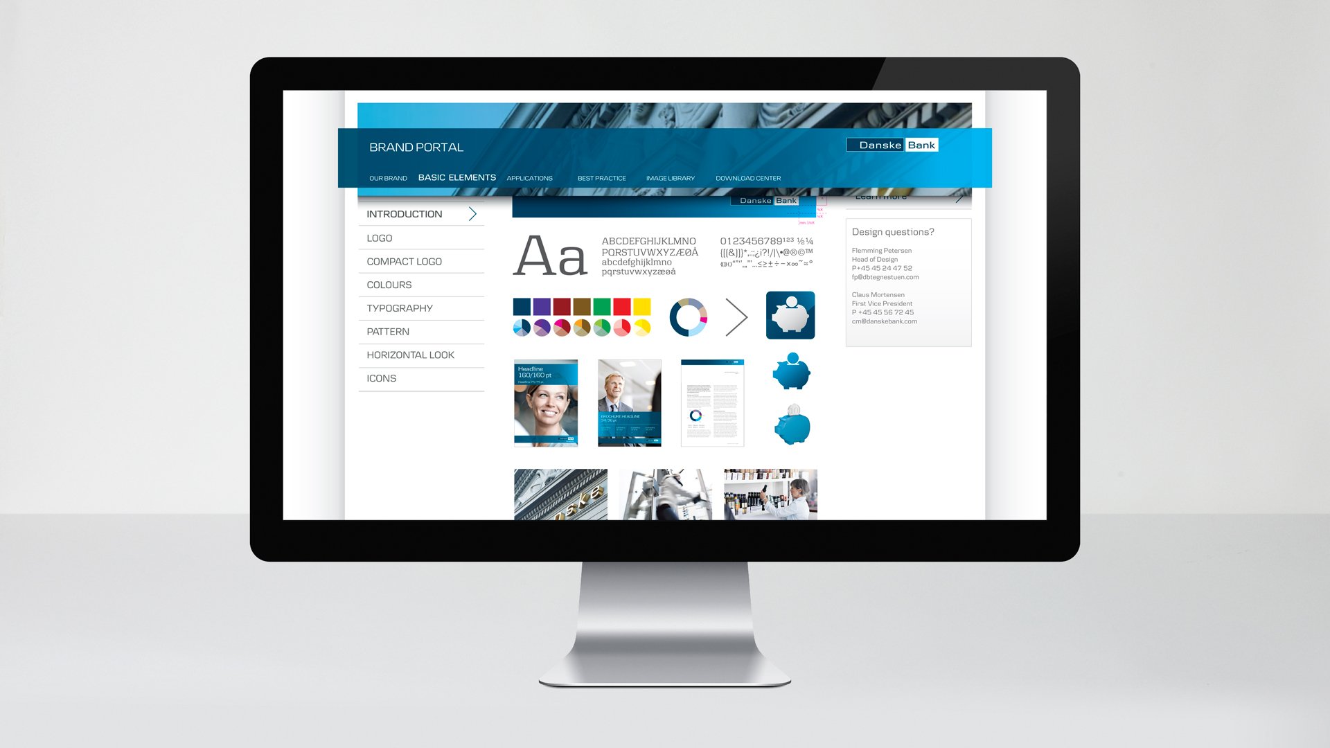
Guidelines
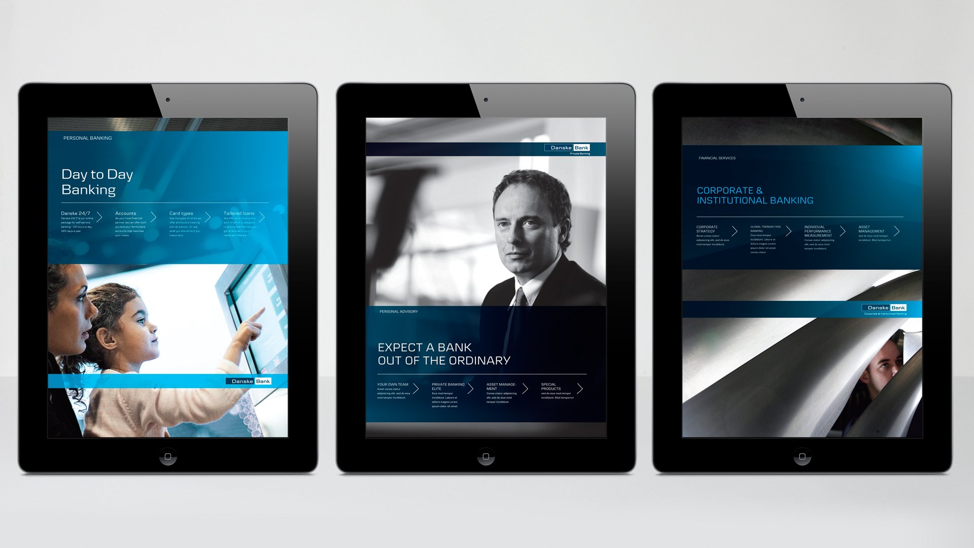
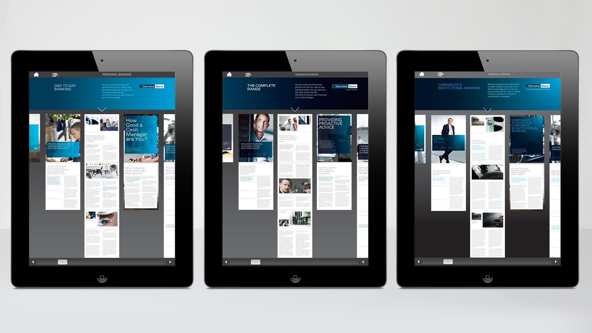
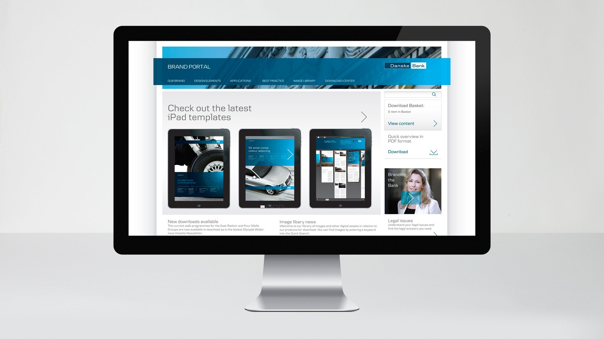
An entire set of customisable templates for all media, ranging from digital brochures and posters, to advertisements and billboards.
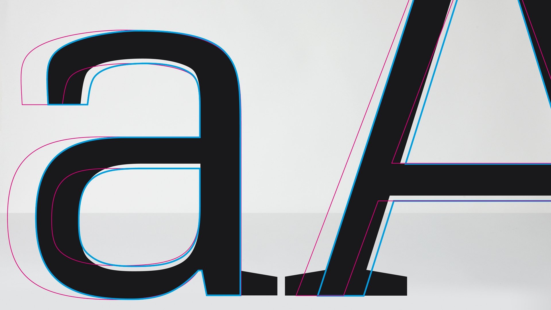
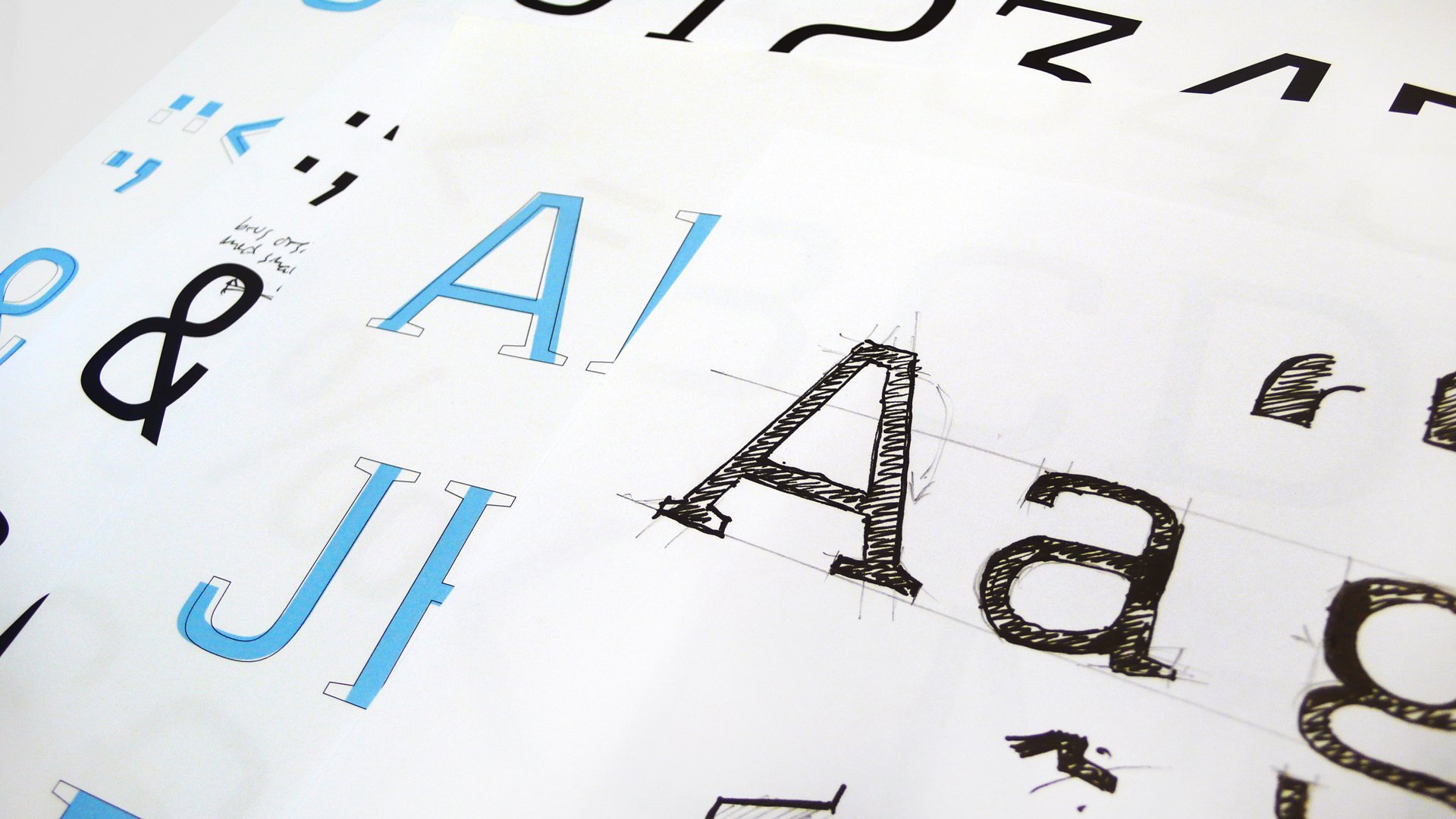
A new set of specially made corporate typographies.
A new look and feel of photos.
New standards for icons and graphics.
An identity that elevates brand impact
New design standards were implemented in 15 markets. The gap between existing design guidelines and new digital media was bridged, and Danske Bank’s design is now aligned across all media channels and brands. Cross-platform synergies have been streamlined, and segment differentiation and brand recognition secured in all European markets.
At LOOP Associates we say that we created a “blue bank with a twist”.
“LOOP Associates proved to have the necessary insight and understanding of Danske Bank’s objectives and needs. Through their process, they challenged us to push the limits of what can be achieved, resulting in a modernised corporate visual identity that elevates our brand impact in all our markets.”
Claus Mortensen, First Vice President, Danske Bank Group Communications

A need for a modern corporate identity
Danske Bank’s existing design was developed in 1999 for the Scandinavian market. During recent years, the bank has expanded into new markets and are now serving more than 5,000,000 clients in 15 countries.
In order to encompass the new markets and fulfil the bank’s ambition of being second-to-none when it comes to digital banking, the corporate identity needed:
A visual update.
A more contemporary look.
New standards for visual brand presence on digital platforms.
Therefore, Danske Bank partnered up with LOOP Associates on a common mission to modernise the banks corporate identity.
Visual differentiation on all platforms
To ensure consistency and maximum brand recognition in the bank’s different markets and segments, LOOP Associates developed a system for visual differentiation which would work on all platforms.
By modernising every aspect of the corporate identity and adding new elements to it, we gave the bank a serious and solid, yet more accommodating, look.
To ensure consistency and ease of use for Danske Bank, we created:
Guidelines
An entire set of customisable templates for all media, ranging from digital brochures and posters, to advertisements and billboards.
A new set of specially made corporate typographies.
A new look and feel of photos.
New standards for icons and graphics.
An identity that elevates brand impact
New design standards were implemented in 15 markets. The gap between existing design guidelines and new digital media was bridged, and Danske Bank’s design is now aligned across all media channels and brands. Cross-platform synergies have been streamlined, and segment differentiation and brand recognition secured in all European markets.
At LOOP Associates we say that we created a “blue bank with a twist”.
“LOOP Associates proved to have the necessary insight and understanding of Danske Bank’s objectives and needs. Through their process, they challenged us to push the limits of what can be achieved, resulting in a modernised corporate visual identity that elevates our brand impact in all our markets.”
Claus Mortensen, First Vice President, Danske Bank Group Communications