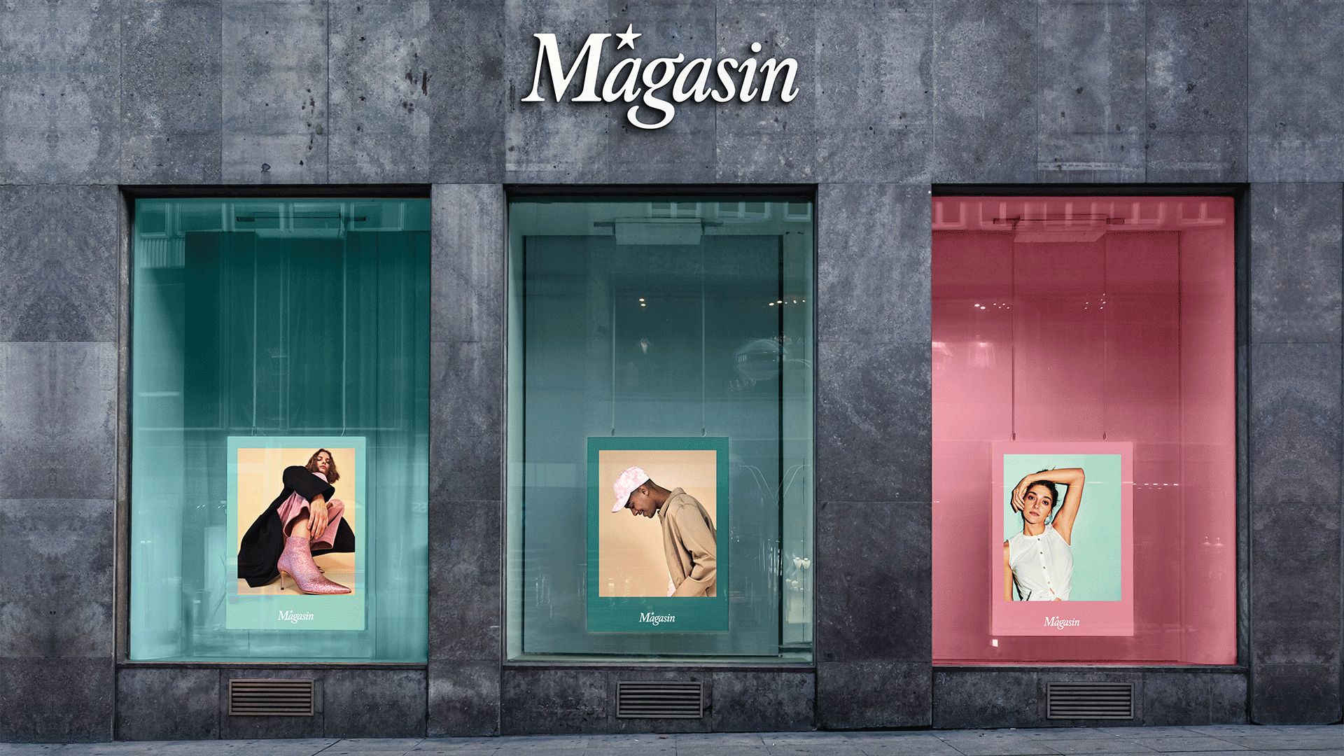
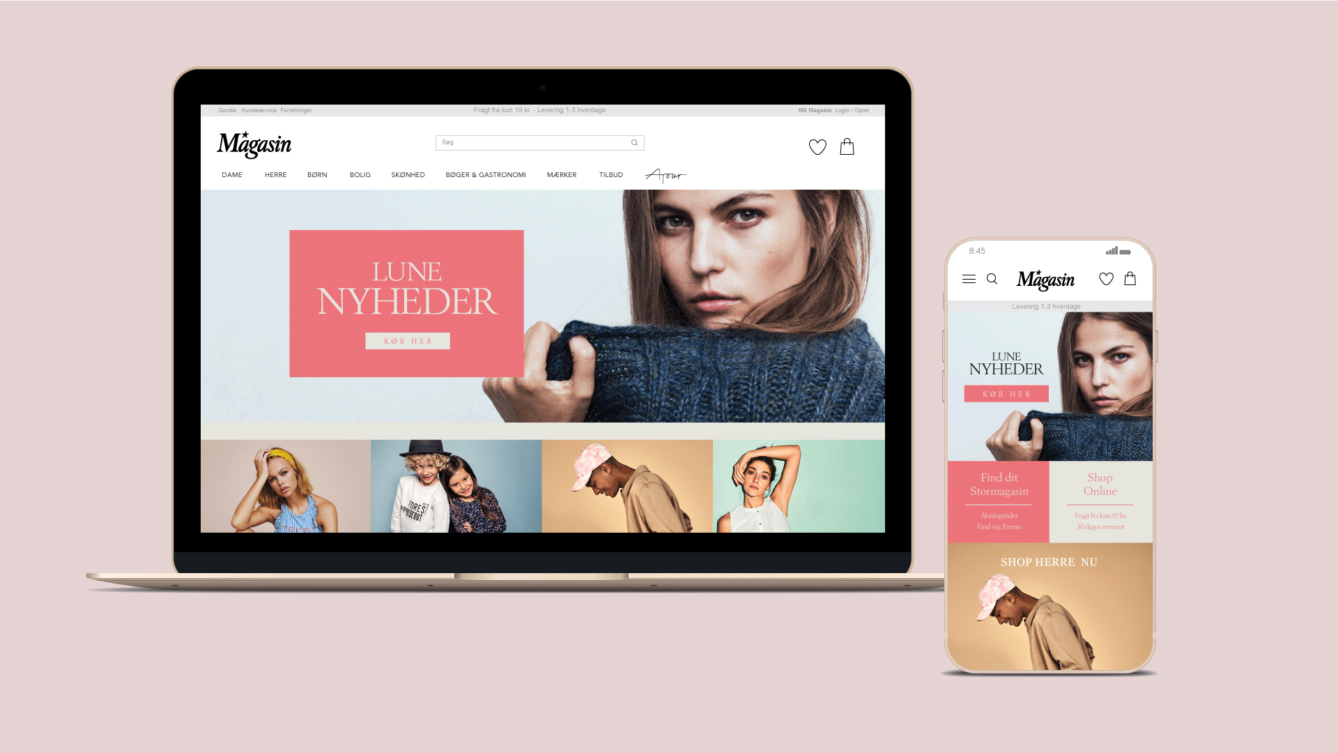
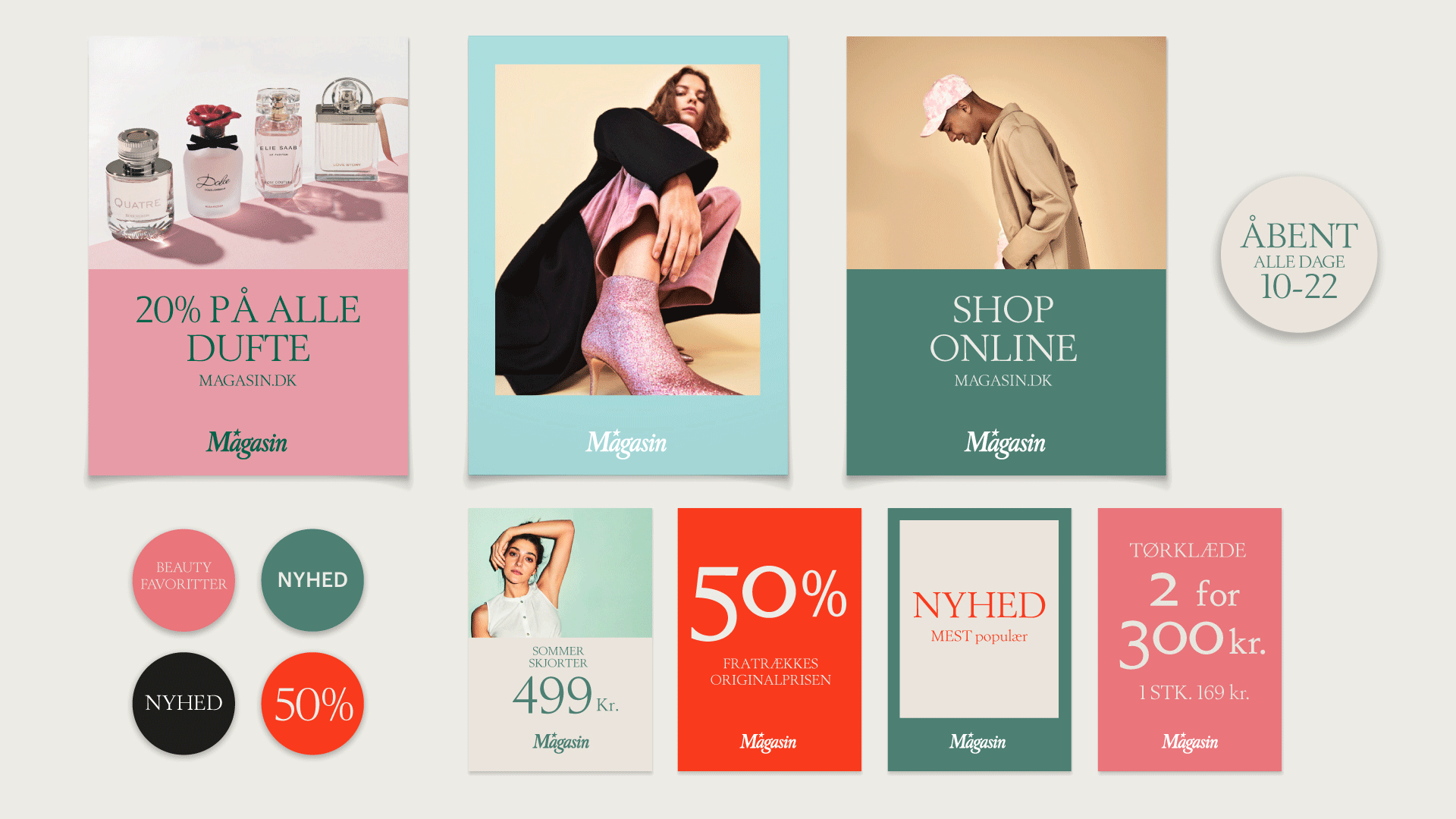
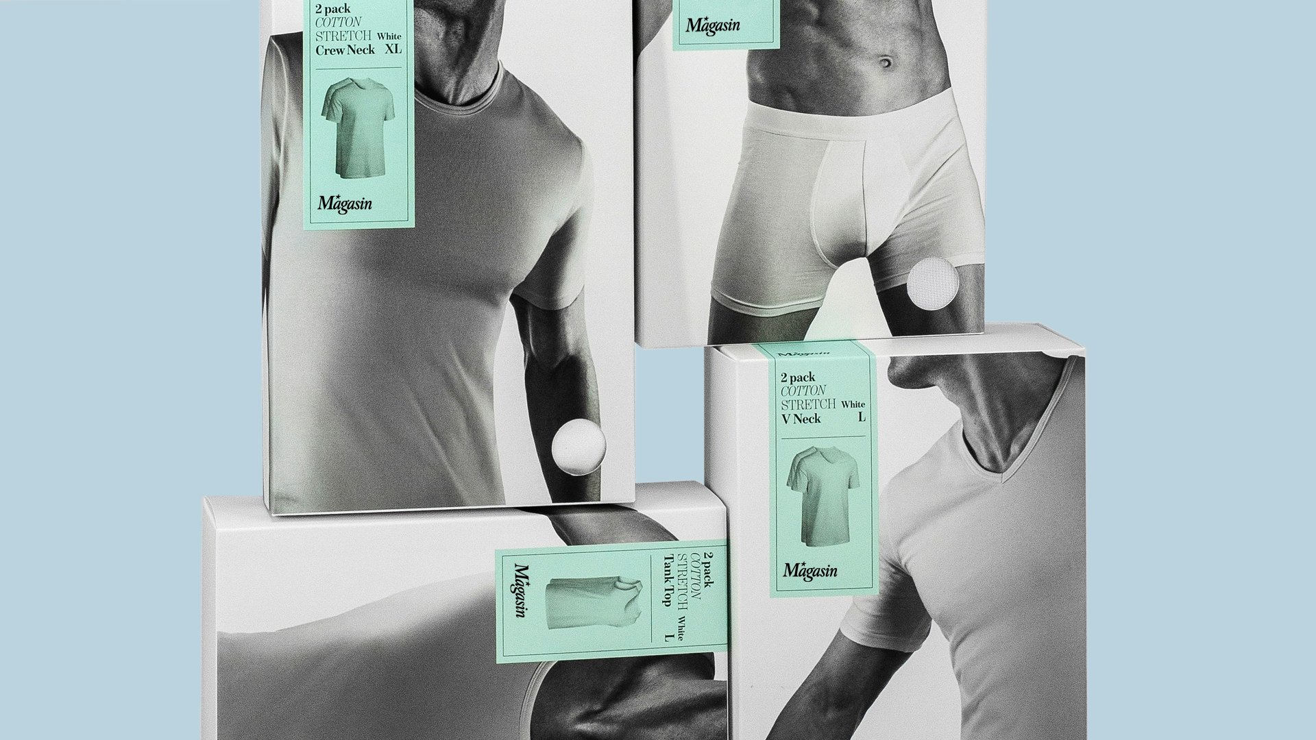
A visual consistency connecting to every touchpoint
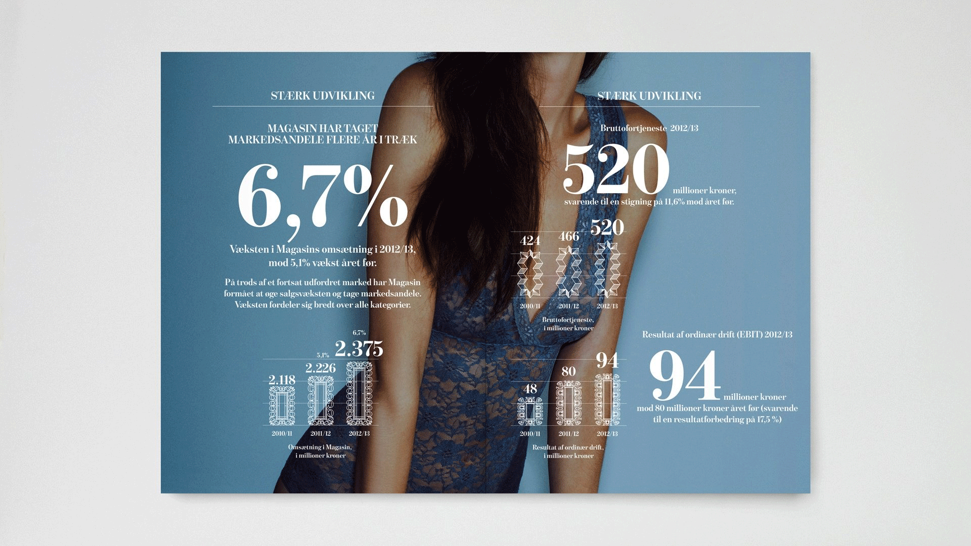
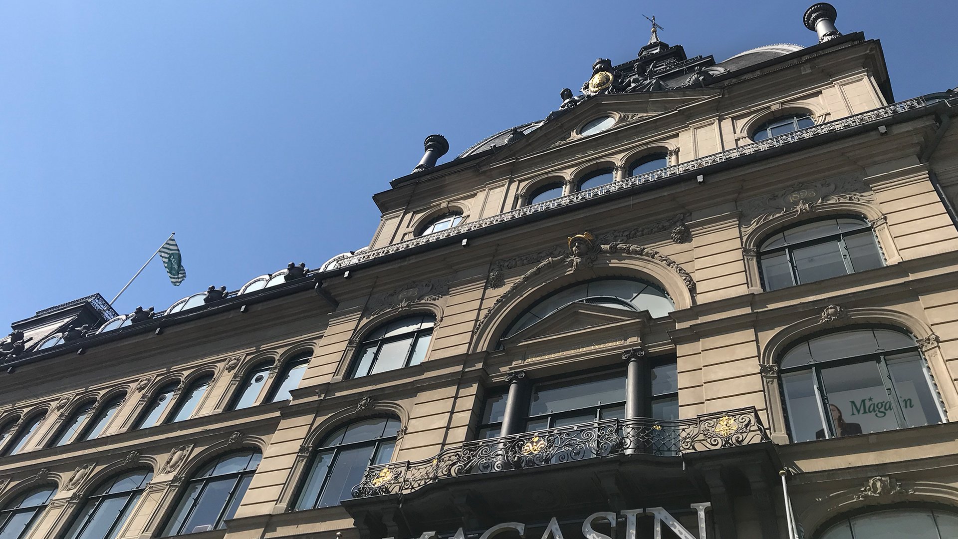
Magasin Du Nord was founded in 1868 and is Denmark’s oldest and largest chain of department stores. Magasin has 20 million visitors and yearly revenue of more than DKK 2.5 billion. Magasin wants to create inspiring shopping experiences and be one of the most successful department stores in Europe. Their promise to the customers is to give ‘a little more than they expect.
A contemporary design
We’ve collaborated with Magasin on a significant rebrand, unifying all platforms with a simple yet versatile identity that has the focus on optimizing friction/cost and lead-time in the marketing and design processes from pre-order to in-store launch.
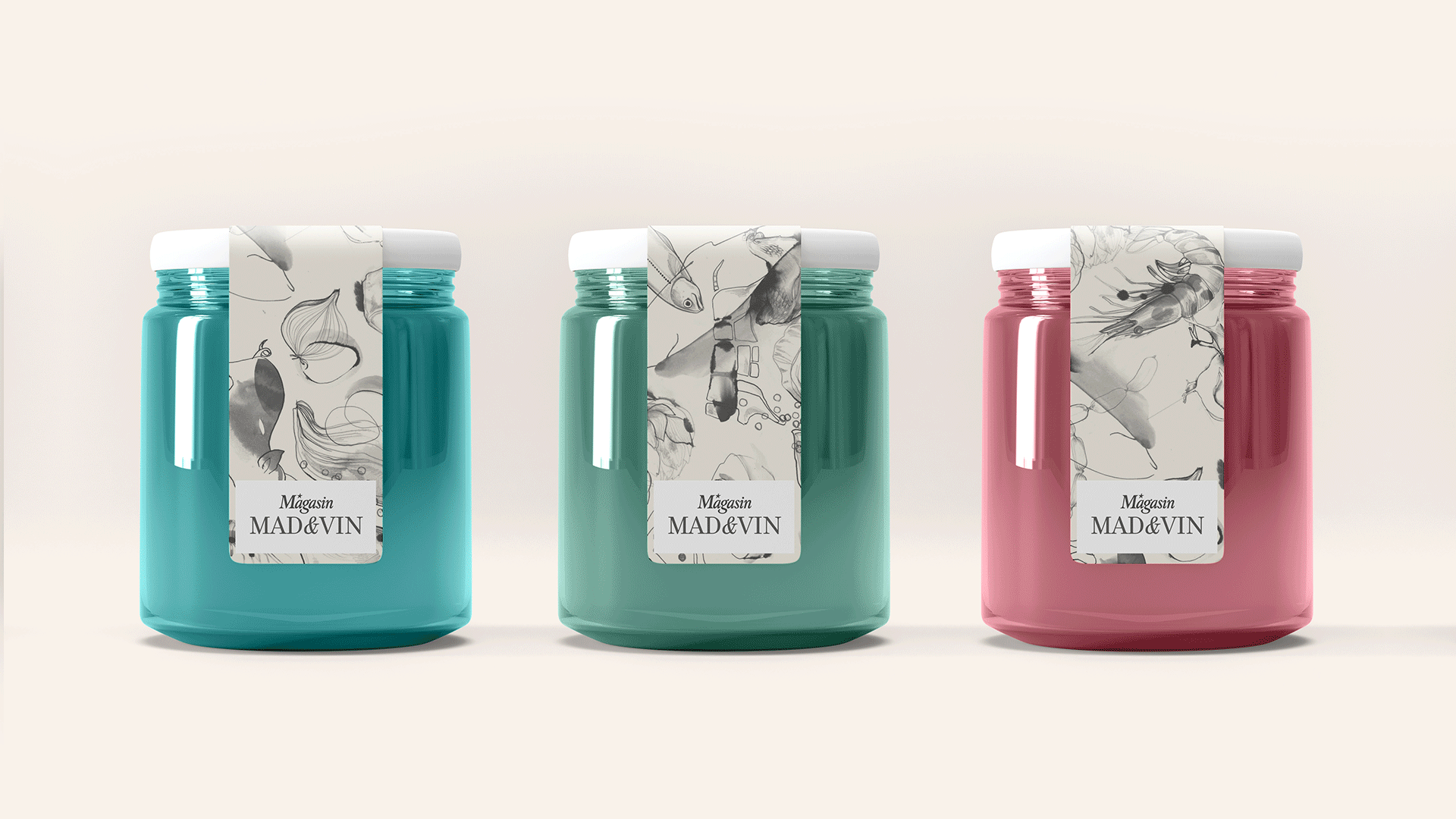
Update included, update the classic Magasin Logo, update the Mad & Vin logo, new products/packaging.
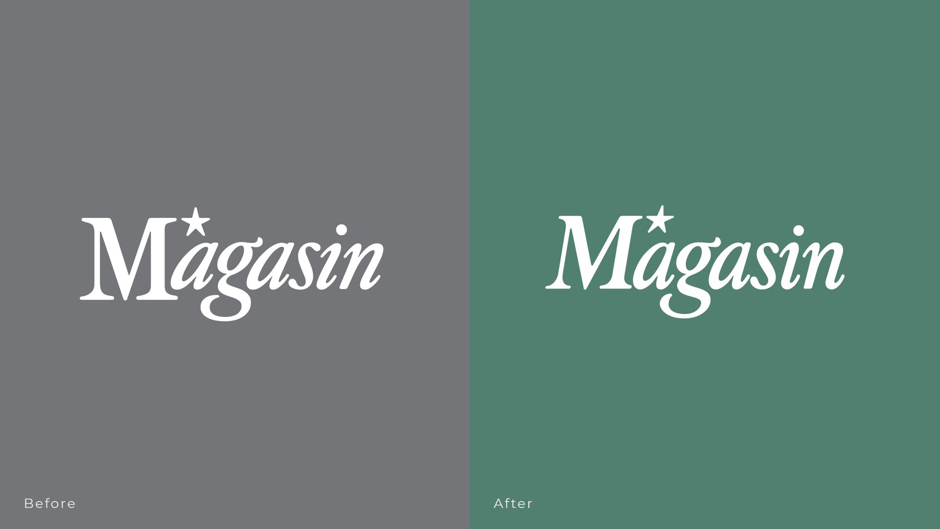
Logo Evolution
The Magasin logo has largely been the same since its inception in 1952. It’s hugely recognized and in Denmark a household mark, but one that, when looked at closely, wasn’t the most finessed piece of lettering. The new logo maintains everything recognizable about the original but gives it a much-needed trim, optimization to new platforms and accentuating some of its quirks. Like the “M” that is now online and italic like the rest of the letters, and to maintain the harmony the famous Magasin star is now also following the italic style. The evolution will allow the logo to survive (and thrive) for at least another 50 years.
Logo animation in corporation with Thank You Studio
A visual consistency connecting to every touchpoint
Magasin Du Nord was founded in 1868 and is Denmark’s oldest and largest chain of department stores. Magasin has 20 million visitors and yearly revenue of more than DKK 2.5 billion. Magasin wants to create inspiring shopping experiences and be one of the most successful department stores in Europe. Their promise to the customers is to give ‘a little more than they expect.
A contemporary design
We’ve collaborated with Magasin on a significant rebrand, unifying all platforms with a simple yet versatile identity that has the focus on optimizing friction/cost and lead-time in the marketing and design processes from pre-order to in-store launch.
Update included, update the classic Magasin Logo, update the Mad & Vin logo, new products/packaging.
Logo Evolution
The Magasin logo has largely been the same since its inception in 1952. It’s hugely recognized and in Denmark a household mark, but one that, when looked at closely, wasn’t the most finessed piece of lettering. The new logo maintains everything recognizable about the original but gives it a much-needed trim, optimization to new platforms and accentuating some of its quirks. Like the “M” that is now online and italic like the rest of the letters, and to maintain the harmony the famous Magasin star is now also following the italic style. The evolution will allow the logo to survive (and thrive) for at least another 50 years.
Logo animation in corporation with Thank You Studio