A need to unify the Scandinavian look
Coca-Cola, the world’s most recognized brand, lacks global brand guidelines, posing challenges in local development. Consequently, there’s a disparity in appearance and messaging. In the Scandinavian region, their identity evolves differently in each country, prompting the brand to seek unification and consistent branding. The aim is to create a striking yet familiar Scandinavian Coca-Cola look.
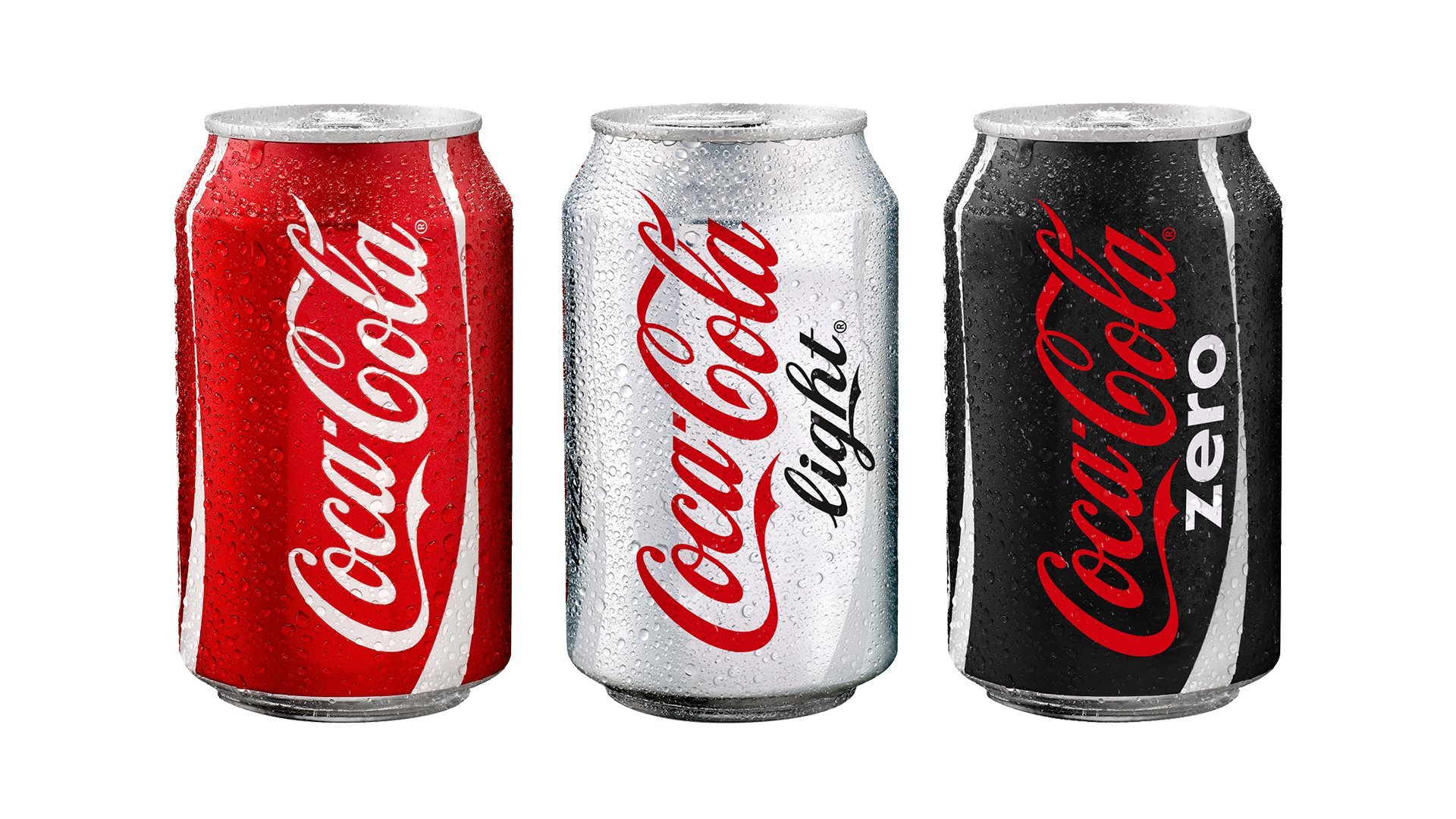
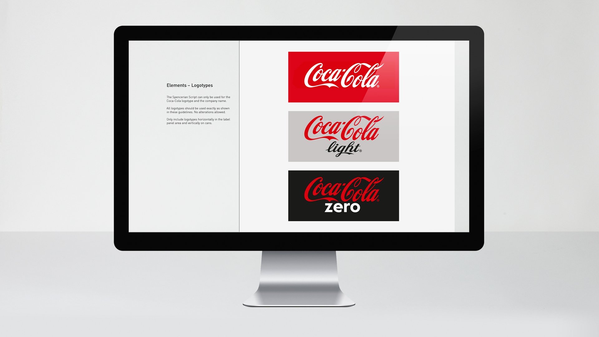
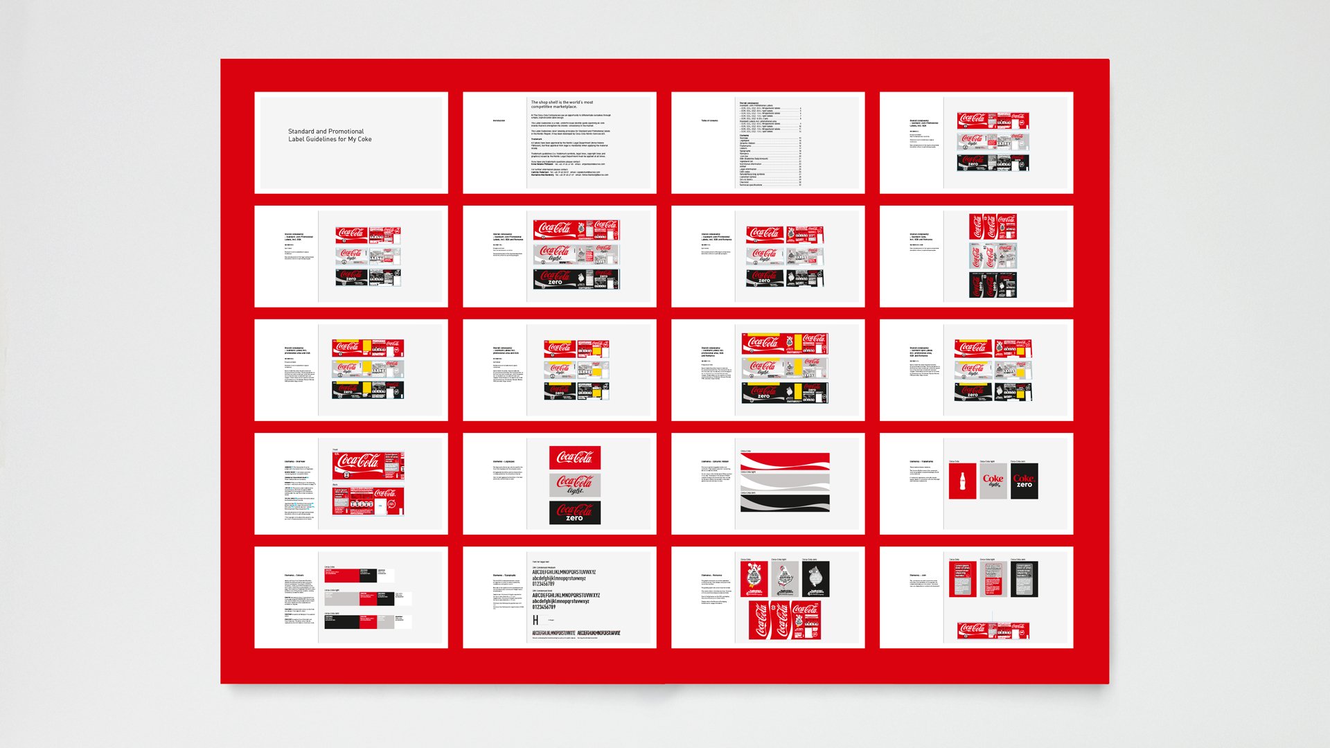
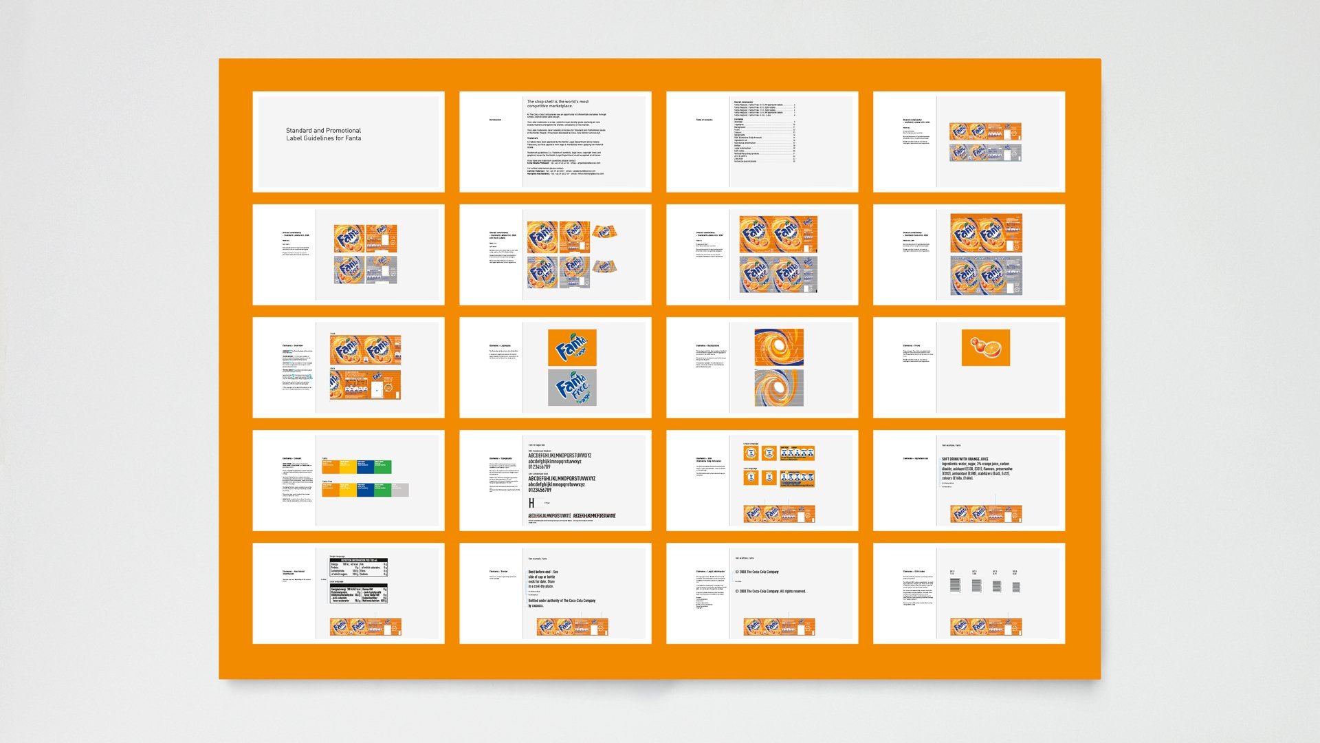
Flexible guidelines for all brands
Working with the iconic Coca-Cola brand’s visual expression is awe-inspiring. Delving into the archives, we extracted its core visual idea. Collaborating closely, we streamlined labels and created unified brand expression guidelines. This allowed for seasonal and promotional variations. Our solution prioritized flexibility, encompassing Coca-Cola Zero’s concept design and launch. In the end, we designed visual guidelines for Coca-Cola, Coca-Cola Light, Coca-Cola Zero, Fanta, and Sprite.
Millions in cost reductions
LOOP Associates’ efforts have achieved sustainable brand consistency and seamless integration of ongoing promotions. This resulted in remarkable synergies and significant cost reductions. The project ensured consistent branding, facilitating the easy integration of ongoing promotions and new brand extensions. This success has positioned LOOP Associates’ design work in the Scandinavian region as an exemplar of sustainable brand identity.
“LOOP Associates’ work has led to sustainable brand consistency and flexible integration of ongoing promotions, resulting in outstanding synergies and millions in cost reductions.”
A need to unify the Scandinavian look
Coca-Cola, the world’s most recognized brand, lacks global brand guidelines, posing challenges in local development. Consequently, there’s a disparity in appearance and messaging. In the Scandinavian region, their identity evolves differently in each country, prompting the brand to seek unification and consistent branding. The aim is to create a striking yet familiar Scandinavian Coca-Cola look.
Flexible guidelines for all brands
Working with the iconic Coca-Cola brand’s visual expression is awe-inspiring. Delving into the archives, we extracted its core visual idea. Collaborating closely, we streamlined labels and created unified brand expression guidelines. This allowed for seasonal and promotional variations. Our solution prioritized flexibility, encompassing Coca-Cola Zero’s concept design and launch. In the end, we designed visual guidelines for Coca-Cola, Coca-Cola Light, Coca-Cola Zero, Fanta, and Sprite.
Millions in cost reductions
LOOP Associates’ efforts have achieved sustainable brand consistency and seamless integration of ongoing promotions. This resulted in remarkable synergies and significant cost reductions. The project ensured consistent branding, facilitating the easy integration of ongoing promotions and new brand extensions. This success has positioned LOOP Associates’ design work in the Scandinavian region as an exemplar of sustainable brand identity.